10 Essential Web Design Principles Every Designer Should Know
January 26, 2024
No matter whether you're a budding designer, a seasoned pro looking for a refresher or a business owner looking to undertake a new website. Understanding the core principles of web design is crucial to getting the most out of your digital shop window. There are a few core principles that can help transform your designs from meh to marvellous!
1. Keep It Simple! I mean, really simple
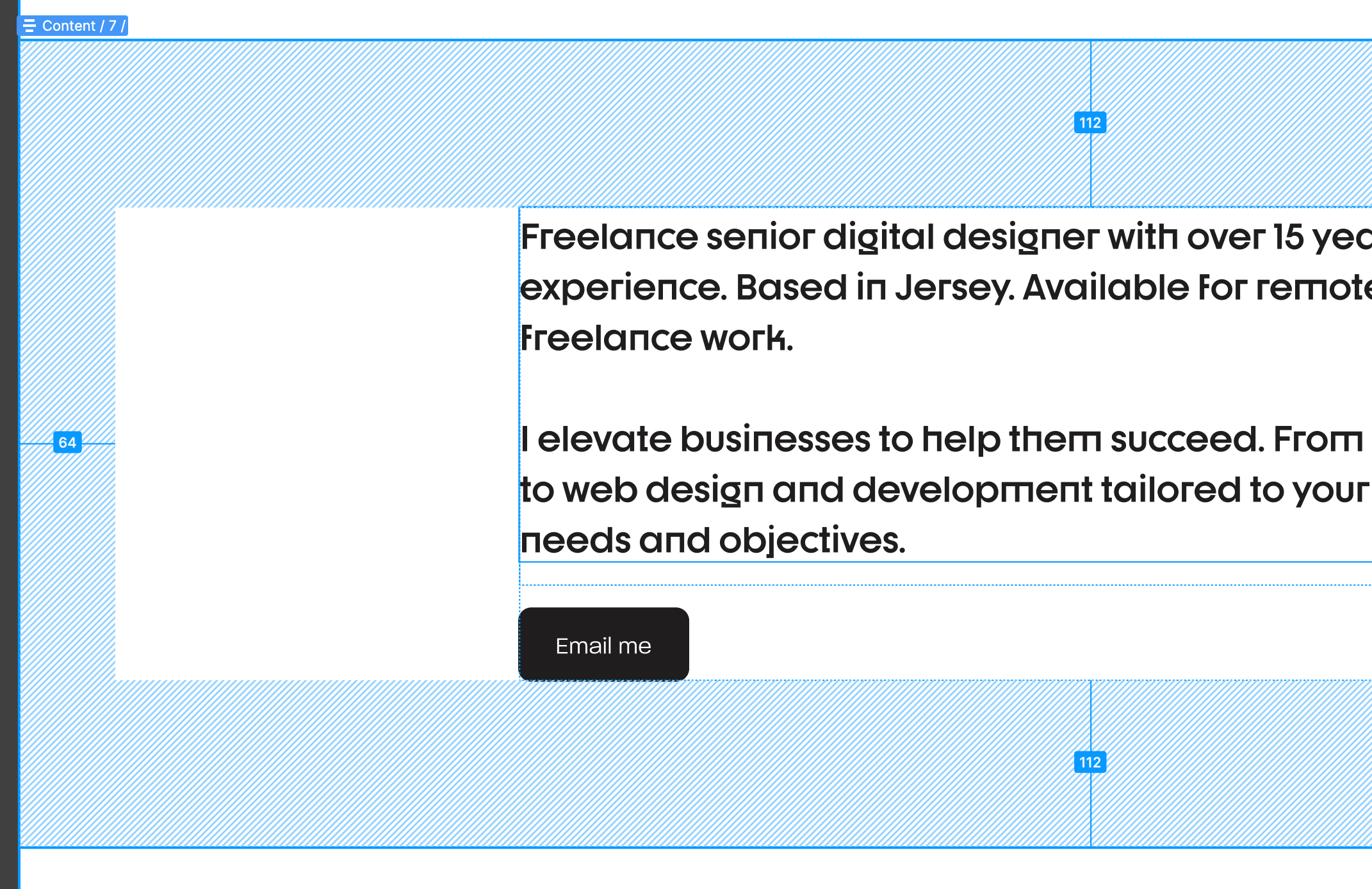
Simplicity is the soul of modern web design. A clean, uncluttered layout not only looks appealing but also enhances user experience. Think of it as the minimalism trend in fashion - less is more! Always note the job of each website page, does this page need to inform a user about a product or service? Maybe it needs to capture some information? Understand who is likely to land on each page, and place the content you expect them to most likely want first and foremost.
2. Responsive Design is Non-Negotiable
In a world where a fridge can browse the internet, ensuring your design looks great on all devices is a must. Although, I can pretty much guarantee making your site 'fridge-focussed' is probably not worth the effort. Responsive design is like a one-size-fits-all dress that magically fits everyone and with more and more traffic from different devices, making sure your website looks and functions well is a must.
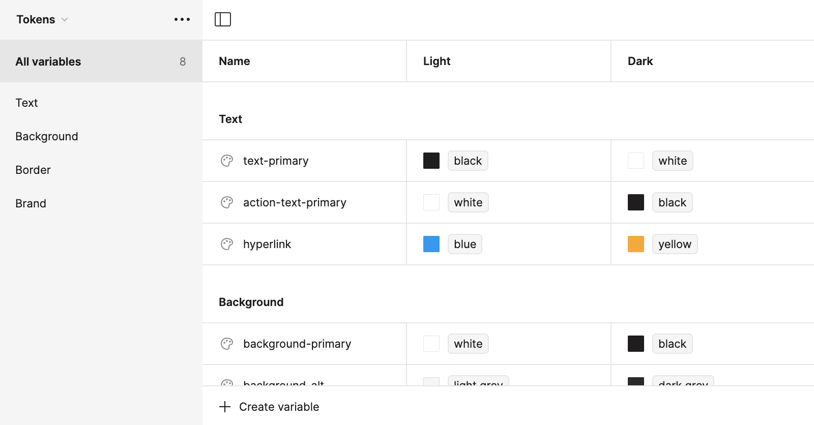
3. Consistency is Key
Consistency in design is like having a good rhythm in music – it keeps the user experience smooth and harmonious. Ensure your fonts, colours, and layout structures sing the same tune throughout your site. It may seem obvious, but little consistencies like this not only make the site feel on-brand and personal, but they help users feel less overwhelmed with each page click. If they don't have to digest 'visual change' each time they navigate to a new page, they'll feel less overwhelmed.
4. Colours Speak Louder Than Words
Colours aren't just pretty; they're powerful. They can invoke emotions, convey messages, and even influence decisions. Be like a colour wizard – choose your palette wisely to cast the right spell on your audience. More importantly, use them sparingly! Find a bold, bright brand colour and use it for action elements. Buttons, links and anything that 'drives' your user forward, should be this action colour.
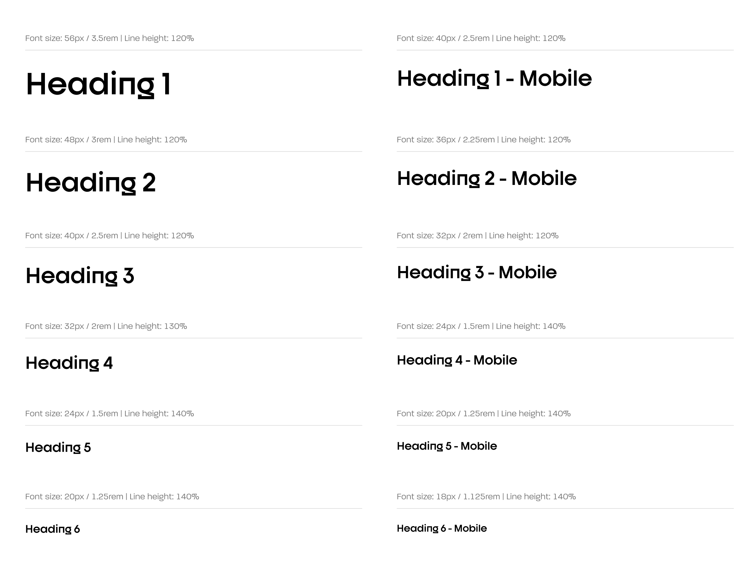
5. Typography Tells a Story
Your choice of typography is like the voice of your website. Make sure it speaks clearly, is easy to read, and matches the personality of your brand or message. Remember, Comic Sans is not always the party guest you want. As a good rule of thumb, stick to one or two font families!

6. User Navigation: Make It a Joyride
Navigating your website should be as easy and enjoyable as a joyride on a Sunday afternoon. Clear, intuitive navigation is like a GPS for your users – it helps them reach their destination without getting lost. Keep links simple, 'About Us' is better than 'The Squad'. Users should know where links will take them before having to click and find out!
7. Speed Thrills, Delay Kills
Website loading time is like waiting in line for coffee – the quicker, the better. Optimise your images and streamline your code to keep your site speedy. Try to stick to web-friendly formats if possible, WEBP, JPG and PNGs. Keep them small, under 1 MB to keep your site as snappy as possible. A fast site is a happy site!
8. Content is King, but Context is Queen
Great content is crucial, but how you present it can make all the difference. Ensure your content is not just informative but also engaging and easy to digest. It's like serving a gourmet meal - presentation matters! Break up long-form text with good, strong section titles and catchy headings. A wall of text is too much for most users, but by breaking it up into manageable sections your visitors will have no problem browsing your carefully crafted site.
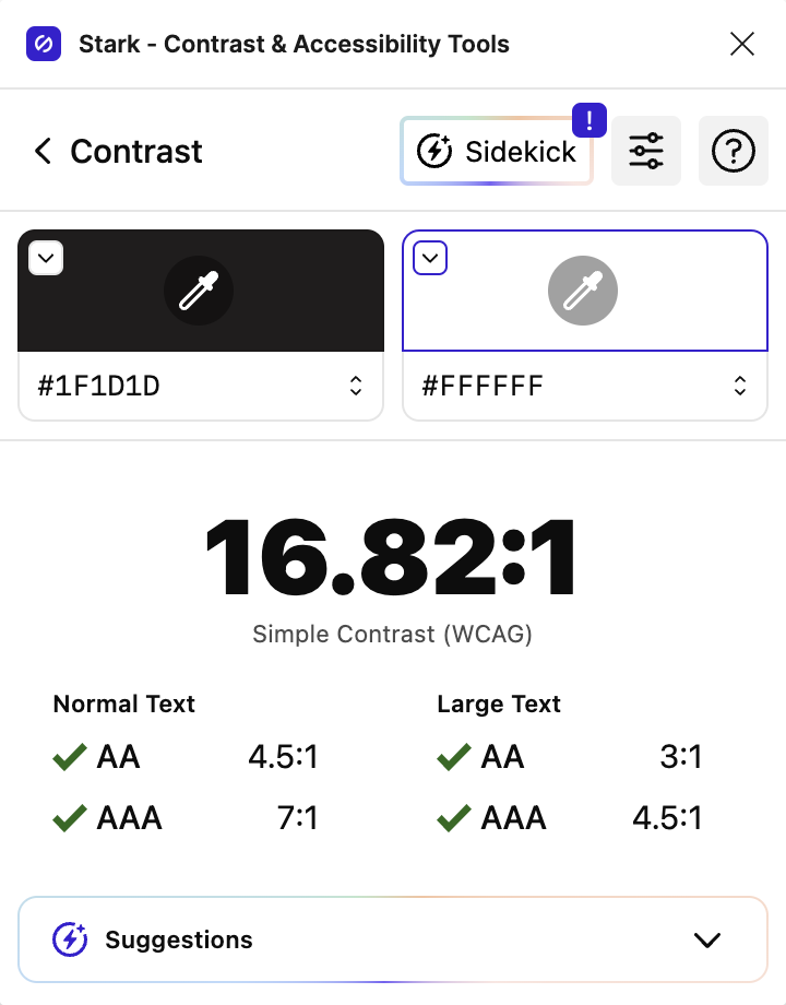
9. Accessibility is Awesome
Designing for all is not just ethical but also practical. Ensure your website is accessible to everyone, including those with disabilities. It’s like holding the door open – it’s courteous and everyone appreciates it. Clear labels, imagery with alt-text and good colour contrast are 90% of the battle. Try to stay away from light pastel colours unless you're pairing them with darker colours for text. You've spent all this time designing a beautiful site, you want people to be able to see the content.
10. Test, Tweak, Repeat
Finally, never stop testing and tweaking. The web world is always evolving, and so should your designs. Think of it as evolution – only the best designs survive and thrive. Keep on evolving and keep on improving!
There you have it – ten essential web design principles that can elevate your work from good to great. Remember, web design is an art and a science, and mastering these principles is key to creating websites that are not only visually stunning but also highly functional. Learn the basics, but break the rules. Be creative. Follow some basic rules and you'll be well on your way to creating a coded masterpiece.
Have a project in mind?
VisionaryGrid is trusted by startups, businesses, and enterprises globally. Discover how we can collaborate with you to explore opportunities, address challenges, and accelerate growth.
Book a 15 minute consultation call