The Art of Typography in Web Design: Choosing Fonts That Make an Impression
October 16, 2023
Typography plays a crucial role in web design, as it sets the tone, enhances readability, and expresses the personality of a website. There's no point in having a world-class website with top-tier content if your visitors can't read it. So carefully selecting your fonts can make a significant impact on how content is perceived and how users engage with it. Let's take a look at the art of typography in web design and delve into the best practices for choosing fonts!
1. Understanding the Power of Typography
Typography goes beyond just choosing a fancy font. It has the potential to evoke emotions, convey a brand's message, and improve user experience. In web design, typography is used to guide users through content, enhance readability, and establish visual hierarchy.
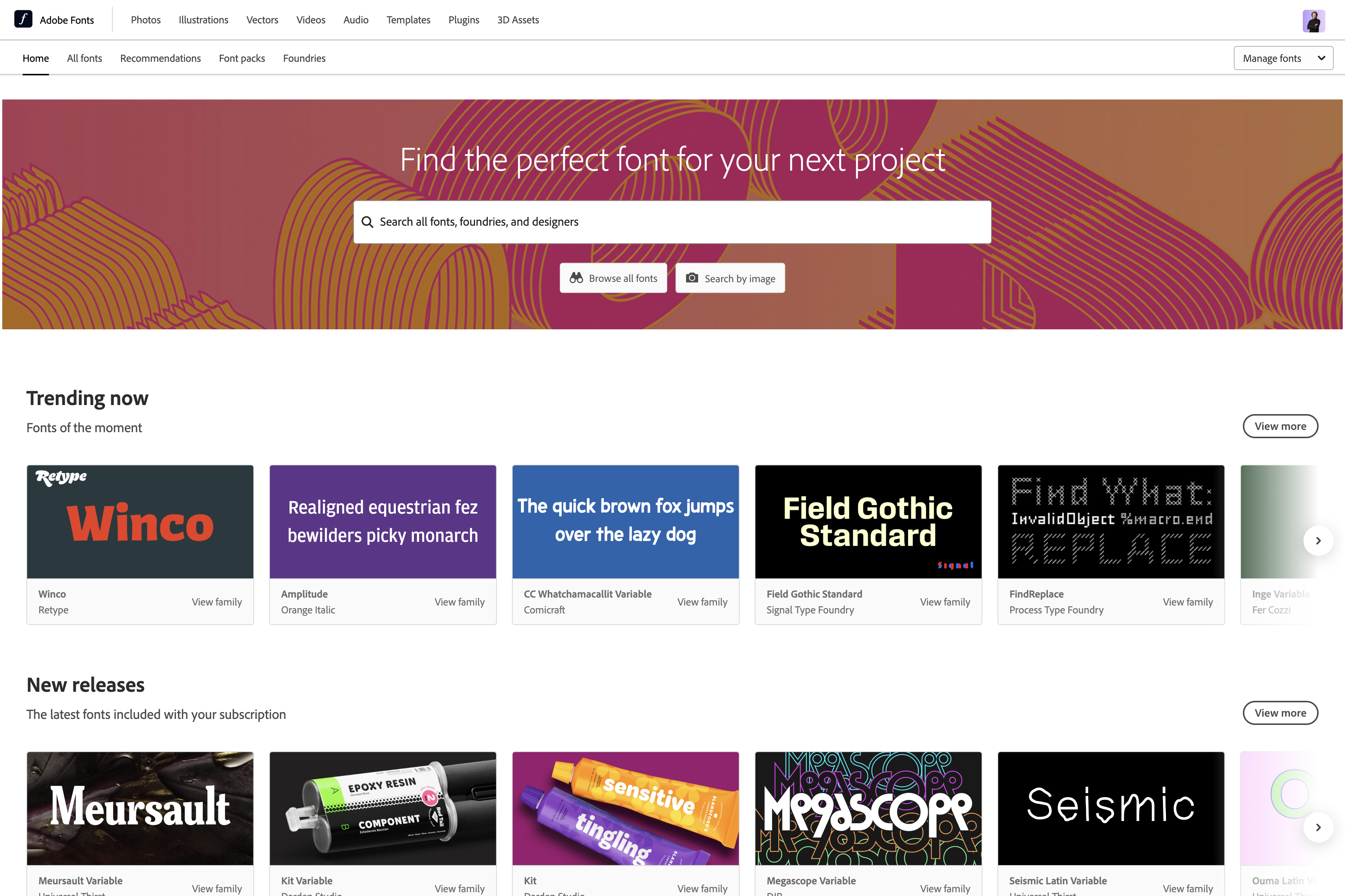
2. Finding the Right Source
When selecting fonts for the web, using providers like Google Fonts and Adobe Fonts can be excellent choices. These platforms offer a wide range of fonts that are specifically optimised for web use, ensuring compatibility and consistency across different devices and browsers. Both Google Fonts and Adobe Fonts provide a vast library of high-quality typefaces, including popular and unique options, giving you the flexibility to find the perfect fit for your projects. Whilst you can use fonts from third-party providers (or upload your own), there's no guarantee these fonts will display how you want them to on other devices.
3. Establishing Consistency
Consistency is key when it comes to typography. Select fonts that align with the overall theme and purpose of your website. By choosing a consistent font system, you create a coherent and visually pleasing experience for users. A well-chosen combination of fonts can elevate your website's design and reinforce your brand identity. As a good rule to follow, try not to choose more than two font families when working on your website.
4. Consider Readability and Legibility
While many beautiful fonts are available, it's essential to prioritise readability and legibility. Fonts should be easy on the eyes and ensure that content is effortlessly consumed. Opt for fonts with a good balance between letterform clarity, spacing, and size. Sans-serif fonts are often a popular choice due to their clean and modern appeal.
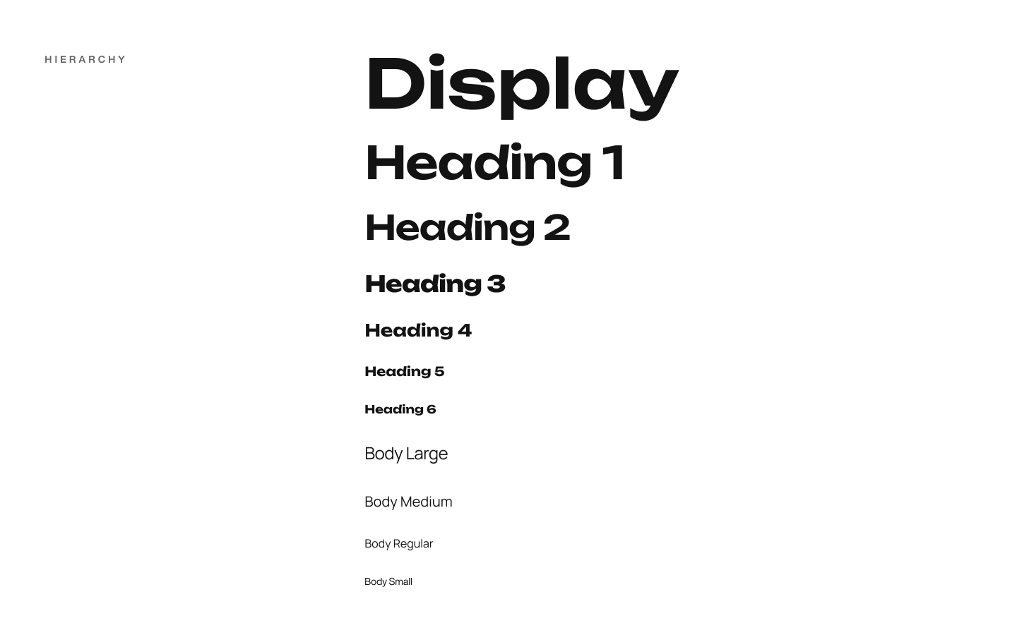
5. Creating Visual Hierarchy
Typography aids in creating a visual hierarchy, helping users navigate through content effortlessly. Employ different font weights, sizes, and styles to establish a clear distinction between headings, subheadings, and body text. Bold and larger fonts can be utilised for headlines, while lighter fonts offer a more subtle approach for supporting text.
6. Highlighting Emphasis
Fonts can be used strategically to highlight important elements such as call-to-action buttons, quotes, or key phrases. Exploring variations in font styles like italics, all-caps, or underlining can draw attention to specific content and create visual interest. However, it's important to exercise restraint and use such variations sparingly to avoid overwhelming the user. Use these techniques to draw the eye to important parts of your website, but don't overdo it.
7. Considering Accessibility
Web design must be inclusive, and this extends to typography choice as well. Ensure that the selected fonts offer adequate contrast to improve legibility for users with visual impairments. Utilise tools to check colour contrast ratios and ensure compliance with accessibility guidelines like WCAG (Web Content Accessibility Guidelines). There are plenty of applications and companies that'll help ensure your colour choices are good for as many users as possible. My personal favourite is Stark!
8. Testing and Feedback
After carefully selecting fonts, testing becomes crucial. Conduct usability testing and gather feedback from users to understand how fonts impact their overall experience. Keep an eye on load times as overly complex fonts can affect website performance. Iterate and refine based on user feedback to optimise typography for your website. It's important to view your website across a range of devices, it's very easy for your typographic choices to look perfect on desktop, but bloated and overly large on mobile. Play it safe and test on-device.
Typography is tricky! It's a powerful tool in web design but it's very easy to overdo it or get the balance wrong. Keep it simple and prioritise readability, consistency, and accessibility. If you think you need a hand with your typography, on or off-screen, get in touch!
Have a project in mind?
VisionaryGrid is trusted by startups, businesses, and enterprises globally. Discover how we can collaborate with you to explore opportunities, address challenges, and accelerate growth.
Book a 15 minute consultation call